Color accessibility: contrast and color blindness, explained simply
A design can look beautiful and still be unreadable for part of your audience. Color accessibility comes down to two things that are easy to check: enough contrast so text can be read, and not relying on color alone to convey information. Both can be verified in a couple of minutes.
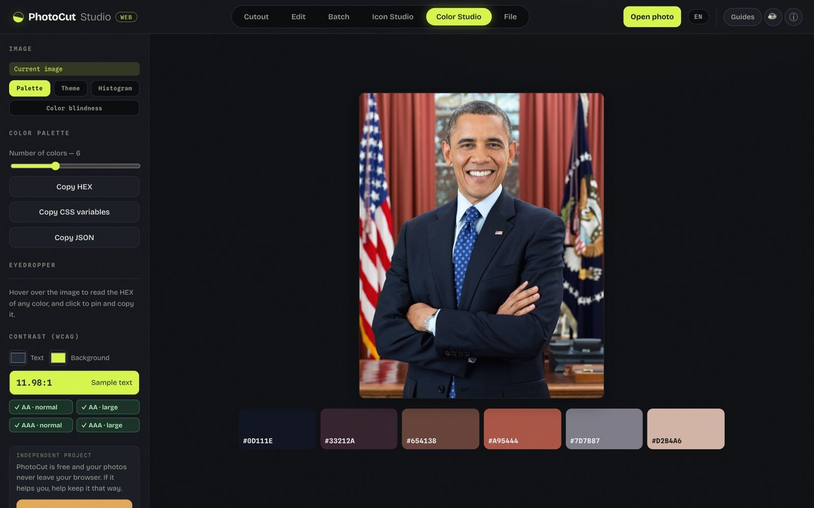
1. Contrast: so the text can be read
Contrast measures how different the text is from its background. It's expressed as a ratio, from 1:1 (invisible) to 21:1 (black on white). The WCAG accessibility guidelines set minimums:
- Normal text: at least 4.5:1 (AA level), or 7:1 for AAA (stricter).
- Large text (headings): 3:1 (AA) is enough.
The typical mistake is light-gray text on a white background: it looks "elegant" but many people can't read it. Before calling a combination good, measure the ratio with a contrast checker: it tells you if it passes AA/AAA for normal and large text.
2. Color blindness: don't rely on color alone
About 8% of men have some form of color blindness (and a smaller percentage of women). The most common cases confuse red and green. That breaks patterns we take for granted:
- A chart that distinguishes categories only by red/green colors.
- A form where an error is marked by "turning the field red".
- A status light (green/yellow/red) with no text or icons.
The golden rule: color should never be the only signal. Always add something more —an icon, a word, a pattern, a different brightness— so the information is understood even if the color isn't perceived.
How to check your design in 2 steps
- Contrast: measure the text against its background with the checker; it should pass AA at minimum.
- Color blindness: simulate how your design looks with protanopia, deuteranopia, tritanopia and in grayscale. If something stops making sense, that information depended on color alone.
Quick best practices
- Body text always with high contrast; reserve light grays for secondary details, not for reading.
- States (success/error) with icon + text, not just color.
- In charts, combine color with labels, patterns or shapes.
- Try your palette in grayscale: if everything is distinguishable, you're on the right track.
All in your browser
Both the contrast checker and the color blindness simulator run locally: you upload an image or pick colors and everything is processed on your device, without uploading anything.
Frequently asked questions
Does accessibility affect SEO or just users?
It helps both: it improves the experience for everyone and is a valued best practice, but the main reason is that more people can use what you make.
We tested it: the contrast checker against my own WCAG arithmetic
Image: I didn't use any image: the tests are on loose colors.
Tool: Color Studio → Palette → Contrast (WCAG).
What I did:
- In Color Studio I entered five color pairs in “Text” and “Background” with the color picker (without loading any image).
- I noted the ratio and the four badges (AA normal, AA large, AAA normal, AAA large) that it shows.
- I calculated each ratio separately with the WCAG 2.x relative luminance formula and compared them.
What I measured:
- #1f2937 on #d6f64b: 11.98:1 → ✓ AA · normal, ✓ AA · large, ✓ AAA · normal, ✓ AAA · large.
- #777777 on #ffffff: 4.48:1 → ✕ AA · normal, ✓ AA · large, ✕ AAA · normal, ✕ AAA · large.
- #767676 on #ffffff: 4.54:1 → ✓ AA · normal, ✓ AA · large, ✕ AAA · normal, ✓ AAA · large.
- #2563eb on #ffffff: 5.17:1 → ✓ AA · normal, ✓ AA · large, ✕ AAA · normal, ✓ AAA · large.
- #ffffff on #d6f64b: 1.22:1 → ✕ AA · normal, ✕ AA · large, ✕ AAA · normal, ✕ AAA · large.
- My separate calculation matched the one the app shows, to two decimals, in 5 of 5 pairs.
- I didn't measure times: it's an arithmetic calculation that updates when the color changes, and the latency of my measuring tool is greater than that of the calculation.
What went wrong or what limit I saw: The checker compares two flat colors: it doesn't measure text over photos or over gradients. In this test I didn't use the color-blindness simulation or measure times. The edge case is useful: #777777 on white (4.48:1) fails AA for normal text and #767676 (4.54:1) passes, by a very small margin.
More guides and tools
Color blindness simulator
See how someone with color blindness sees your image or design and check accessibility.
How to choose a color palette
Roles, 50–900 scales and how to derive a palette from an image.