Generate the dark mode (or light) of a screenshot
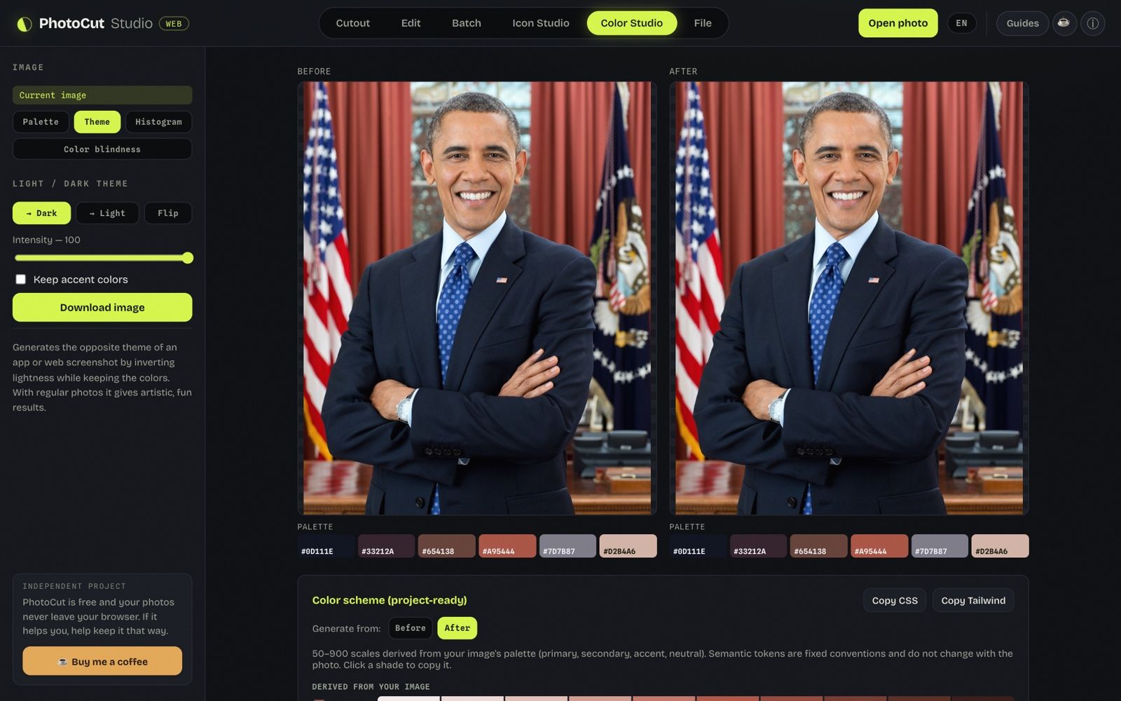
Want to see how your app or website would look in dark mode without touching a line of code? A screenshot is enough. Color Studio can invert the image's lightness while keeping the colors —the real basis of dark mode— and give you the dark (or light) version instantly, with a before/after to compare. All free and in your browser: the screenshot isn't uploaded anywhere.
How the Theme mode works
It's not a simple "negative" of the photo. Inverting the colors outright turns blues orange and everything looks wrong. The Theme mode inverts only the lightness of each pixel and keeps the hue and the saturation: that's why a white background becomes dark, black text lightens, and a blue button stays blue (in my test, #2563eb became #0744cb: darker, not lighter). It's exactly what a good dark theme does.
Step by step
- Go to Color Studio and open the screenshot (or use the image you already have loaded).
- Choose the Theme mode and the target: Dark, Light or Invert.
- Compare the original with the generated version in the Before and After panels.
- Download the result as PNG.
The Dark and Light targets only invert if needed (depending on whether the screenshot is already light or dark); Invert always forces the change.
The project's color scheme
Below the before/after, Color Studio builds the color scheme derived from the image (50–900 scales per role) and leaves it ready to copy as CSS or Tailwind. It's useful for going from the mockup to real variables without picking the colors by hand out of the screenshot.
What it's for (and what it isn't)
- Yes: quick dark-mode mockups, exploring palettes, pieces for presentations, seeing how an interface "breathes" in dark before coding it.
- Yes, fun: throwing in any photos to see artistic and unexpected results.
- No: it doesn't replace implementing the real dark theme in your CSS —an image is not an interface—, but it's the fastest way to visualize the idea.
It works best with UI screenshots
The "flatter" and more UI-like the image (an app, a site, a dashboard), the better it looks: solid backgrounds and text respond perfectly to the lightness inversion. Photographs with gradients and skin give a more artistic than utilitarian result — but trying them is part of the fun.
We tested it: a light screenshot turned dark and what really changes
Image: captura-ui-clara.png, 1280 × 720 px, 41 KB (synthetic image I drew with Pillow).
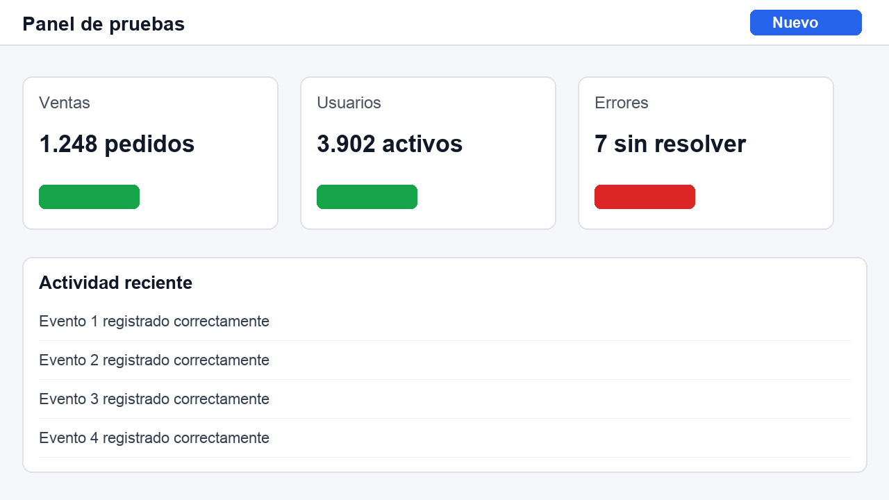
Tool: Color Studio → Theme → “→ Dark”.
What I did:
- I loaded captura-ui-clara.png (1280 × 720 px, 41 KB), a screenshot of an app in light mode that I drew myself.
- In Color Studio → “Theme” I left “→ Dark” at intensity 100 and downloaded the image.
- I ticked “Keep accent colors”, downloaded again and read five reference pixels in the three versions.
- I pressed “Copy CSS” on the color scheme and read the clipboard.
What I measured:
- Mean luminance went from 245 to 4 (on a 0 to 255 scale). Dark mode was drawn in 14 ms and the download took 78 ms.
- page background: #f5f7fa → #000000 (with accents: #000000).
- card background: #ffffff → #000000 (with accents: #000000).
- blue button: #2563eb → #0744cb (with accents: #2563eb).
- red badge: #dc2626 → #a40000 (with accents: #dc2626).
- green badge: #16a34a → #005600 (with accents: #16a34a).
- The contrast between the page background and the card background went from 1.07:1 to 1.00:1.
- With the intensity at 70 the page background is #2f3033 and the card #2e2e2e: contrast 1.03:1.
- The copied color scheme has 87 lines.
What went wrong or what limit I saw: At intensity 100 the page background and the card background both became #000000: the contrast between them fell to 1.00:1 and the cards can no longer be told apart. At intensity 70 it is still almost invisible. The accents get darker if I don't tick “Keep accent colors”. It's a simple, synthetic screenshot: I didn't test a real screenshot with photos.
More guides and tools
How to choose a color palette
Roles, 50–900 scales and how to derive a palette from an image, ready as CSS or Tailwind.
Color palette & HEX from an image
Pull the dominant colors from an image and read the HEX of any pixel with an eyedropper.