Favicon size: dimensions and HTML to copy
The favicon size you need: 32 × 32 px for the browser tab, 180 px for iOS and 192 and 512 px for PWAs, plus a favicon.ico of 16, 32 and 48 px.
| Size | File · What for |
|---|---|
| 16 · 32 · 48 | favicon.icoUniversal fallback: old browsers, RSS readers, bookmarks. |
| 32 × 32 | favicon-32.pngThe browser tab, on normal and retina screens. |
| 180 × 180 | apple-touch-icon-180.pngiPhone and iPad home screen. No transparency. |
| 192 / 512 | icon-192.png + icon-512.pngPWA manifest: installed app and splash screen. |
| 512 × 512 | maskable-512.pngAndroid crops it: keep the art inside a centered circle of 80 % diameter. |
For years favicon generators produced twenty files "just in case": sizes for Internet Explorer on Windows Vista, Windows 8 tiles, Safari pinned tabs… In 2026 you need none of that. And it's worth the effort: a well-made favicon is the first thing a user sees when they have ten tabs open, and it's usually the first thing a technical SEO audit or a PWA checklist reviews. Missing or broken, it subtracts professionalism even if the rest of the site is flawless.
The HTML
<link rel="icon" href="/favicon.ico" sizes="48x48">
<link rel="icon" href="/favicon-32.png" sizes="32x32" type="image/png">
<link rel="apple-touch-icon" href="/apple-touch-icon-180.png">
<link rel="manifest" href="/site.webmanifest">
<meta name="theme-color" content="#111317">
And the minimal site.webmanifest that references the PWA icons:
{
  "name": "My App",
  "short_name": "My App",
  "icons": [
    { "src": "icon-192.png", "sizes": "192x192", "type": "image/png" },
    { "src": "icon-512.png", "sizes": "512x512", "type": "image/png" },
    { "src": "maskable-512.png", "sizes": "512x512", "type": "image/png", "purpose": "maskable" }
  ],
  "display": "standalone"
}
PNG to ICO: when you still need a .ico
ICO isn't a single image but a container that groups
several resolutions (16, 32, 256 px…) in one file;
the system picks the one it needs depending on where the icon is shown.
You still need it in two cases: the /favicon.ico at the
site root, which many browsers and crawlers request even when it isn't
declared in the HTML, and the executable icon of a Windows app. And
renaming a logo.png to logo.ico doesn't work:
a real ICO has a binary header (ICONDIR) that describes how
many images it holds and at what resolution, and without it Windows and
browsers don't recognize the file as a valid icon.
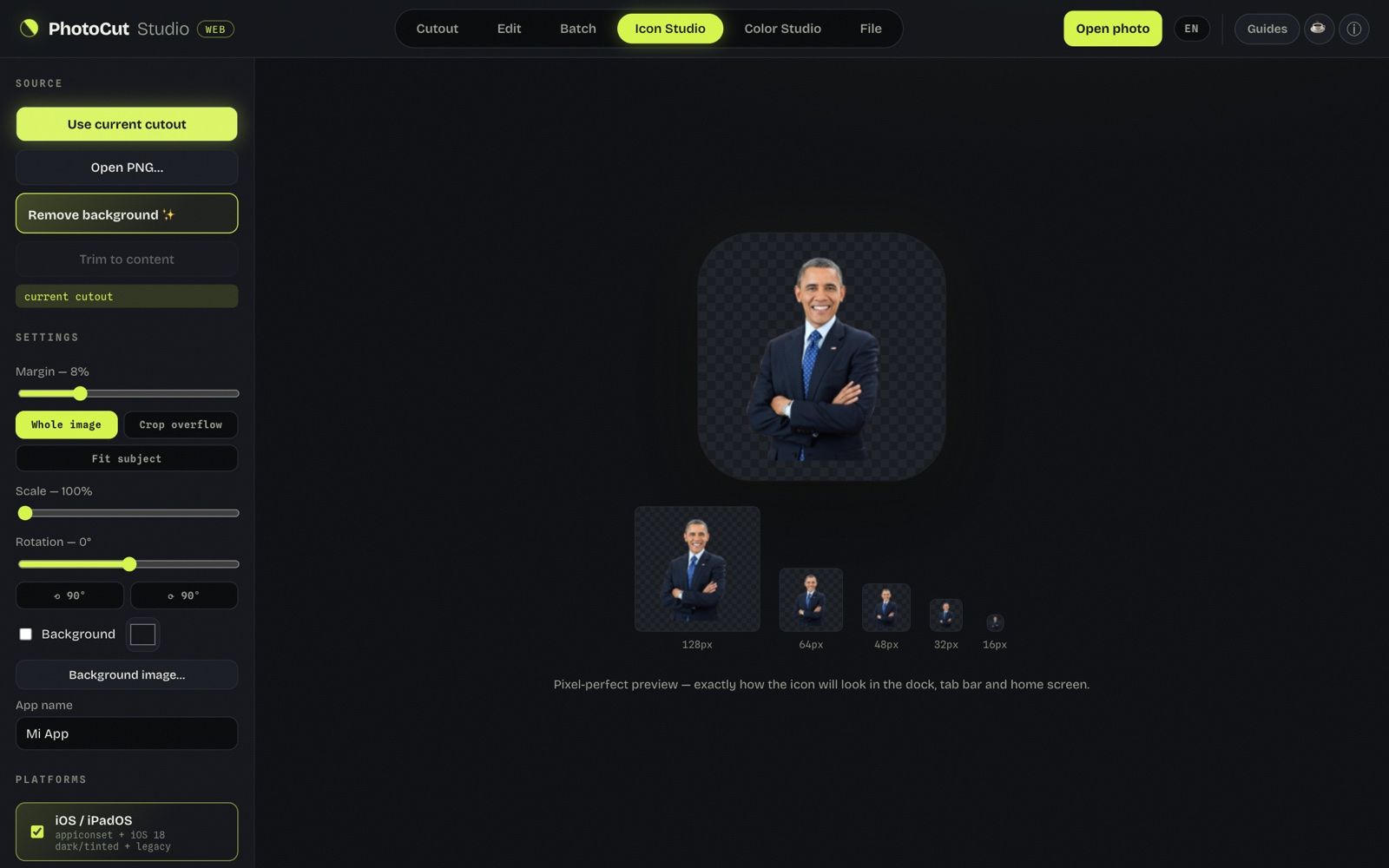
Converting a PNG to ICO with Icon Studio
- Open PhotoCut Studio and go to Icon Studio.
- Upload your source PNG, ideally square and 512 px or more, uncompressed.
- Choose the Windows set: it generates an
app.icowith the 16, 24, 32, 48, 64, 128 and 256 px resolutions embedded in a single file. - Check the preview at 16 and 32 px to confirm the icon is still recognizable.
- Download the
.ico: upload it asfavicon.icoto the site root or use it as your app's icon.
For a Windows app's executable
If you're packaging a desktop app (Electron, Tauri, .NET or whatever you
use), the installer and the executable need a multi-resolution
.ico for Explorer, the taskbar and shortcuts. An ICO with
only 256 px looks blurry when scaled down to 32 or 16 px; with
the seven standard resolutions it looks sharp everywhere. At the format
level it's the same file as the favicon one: only who asks for it
changes.
Common mistakes
- Using the full logo at 16 px. A few strokes fit in the tab: use the symbol, not the wordmark with text.
- Forgetting the maskable. Without it, Android puts your square icon inside a white circle — the classic "icon inside a fried egg".
- Transparency in the apple-touch-icon. iOS replaces it with black. Always put a color background.
- One SVG for everything. The SVG favicon is ideal as a modern complement, but the manifest icons and the apple-touch-icon still require PNG.
- Including a single resolution in the .ico. With only 256 px the system rescales for the small sizes and loses sharpness: always include the full set (16 to 256 px).
- Starting from a PNG with no margin. At 16 px fine detail disappears and, if the art reaches the canvas edge, it looks cropped.
- Trusting transparency without looking at it. ICO supports it, but some old Windows viewers show a gray background instead of transparent: check the preview.
What about the SVG favicon?
For a few years now, Chromium-based browsers and Firefox accept a vector favicon:
<link rel="icon" type="image/svg+xml" href="/favicon.svg">
It's the ideal option if your icon is simple and geometric: a single file
looks sharp at any size and weighs a fraction of a PNG. But it doesn't
replace the full set: place it as an extra line before the
favicon.ico, not instead of it, because Safari and the manifest
icons still need PNG.
How to check they came out right
- Open the site in a new tab and look at the favicon at real size (don't trust the editor preview).
- Test in more than one browser: Chrome, Firefox and Safari interpret the order of
link rel="icon"with subtle differences. - On the phone, add the site to the home screen to see the
apple-touch-icon(iOS) and the manifest icon (Android) as a real user will. - If you don't see the change, clear the cache: browsers cache favicons very aggressively, sometimes for days.
Frequently asked questions
What happens if I don't put a favicon?
The browser shows a generic icon (a blank page or the default icon) and, if the site is installed as a PWA, uses a square with the domain's initial. It doesn't break anything, but it looks unprofessional and doesn't identify your brand in tabs or bookmarks.
Can I convert any PNG to ICO or does it have to be square?
Technically you can convert any PNG, but the result looks better if the original is square: if it isn't, the converter fits it inside a square and may add margins or crop the longer edges.
We tested it: the Web/PWA set and how the favicon looks at 16 px
Image: logo-despues.png, 820 × 637 px, 32.1 KB (sample image from this site).

Tool: Icon Studio → only “Web / PWA” → “Download icon ZIP” and “Copy favicon HTML”.
What I did:
- In Icon Studio I opened logo-despues.png (820 × 637 px, transparent PNG).
- I unticked iOS, Android, macOS and Windows; I left only “Web / PWA”.
- I downloaded the ZIP and pressed “Copy favicon HTML” to read the clipboard.
- I opened the 16 px PNG from the ZIP and measured how much of the square stays opaque.
What I measured:
- 59 KB ZIP with 11 files in 0.1 s: app-icons/LEEME.txt (0.9 KB), app-icons/web/favicon-16.png (0.4 KB), app-icons/web/favicon-32.png (0.7 KB), app-icons/web/favicon-48.png (1.1 KB), app-icons/web/apple-touch-icon-180.png (5.9 KB), app-icons/web/icon-192.png (6.6 KB), app-icons/web/icon-512.png (23.8 KB), app-icons/web/maskable-512.png (15.1 KB), app-icons/web/favicon.ico (2.2 KB), app-icons/web/site.webmanifest (0.4 KB), app-icons/web/snippet.html (0.3 KB).
- The copied HTML has 5 <link>/<meta> lines.
- The 16 × 16 px PNG: 1.6% of the pixels opaque, 20.3% semi-transparent and 78.1% transparent.
What went wrong or what limit I saw: At 16 px the logo's wordmark comes out as a gray streak and only the emblem is recognizable (I looked at it myself, I didn't measure it with a metric). Almost the whole 16 px square is transparent because the emblem is small inside the logo: for a favicon you should crop the logo to the emblem before generating the set.
More guides
App icon sizes in 2026: iOS, Android, macOS, Windows and Web
Every current size in one place, including the iOS 18 and Android 13 variants.
How to make a logo with a transparent background (PNG) free
The clean cutout that's the base of any favicon or icon.